

Key Takeaways
- 1. Leading With Technology
- 2. Using Vague AI Claims
- 3. Showing Generic Robot Graphics
- 4. Having Too Many CTAs
“Learn AI SaaS landing page design best practices. Create high-converting pages with clear messaging, product demos, social proof, and strong CTAs.”
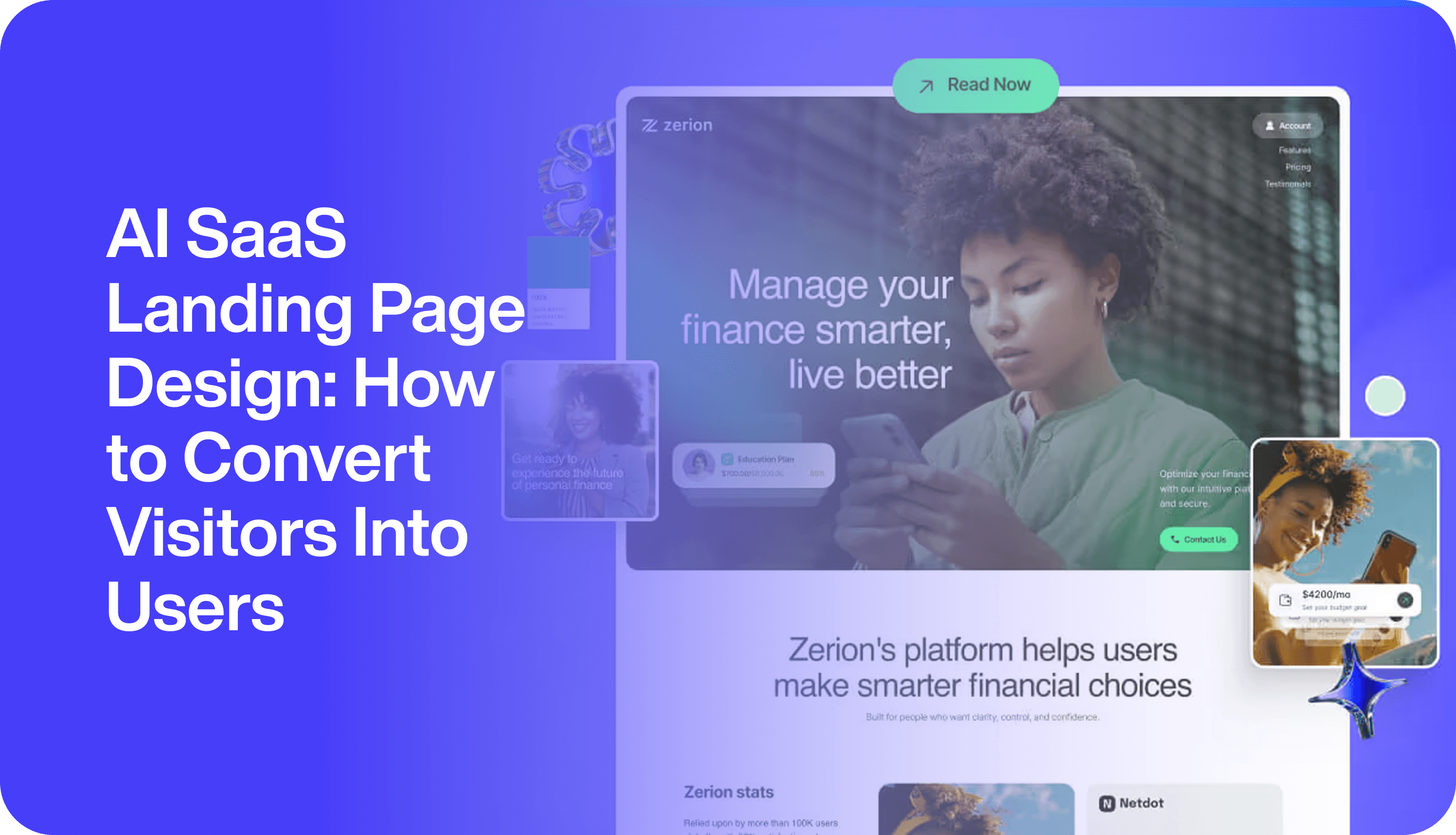
An AI SaaS landing page has one job: help the right visitor understand the product quickly and take the next step. Visitors do not convert because a page looks modern or uses the word “AI.” They convert when they immediately understand the outcome, see proof that the product works, and feel confident about the next action.
A high-converting landing page needs a compelling headline, clear value proposition, benefit-driven copy, strong CTA, social proof, trust signals, a focused goal, optimized forms, fast load speed, and mobile-first design.landy-ai
This guide explains how to design AI SaaS landing pages that turn visitor attention into demo bookings, free-trial signups, and qualified leads.
Start With One Conversion Goal
Every landing page should have one primary conversion goal. Trying to serve everyone with one page usually weakens the message and reduces conversions.
Choose one goal:
- Book a demo
- Start a free trial
- Join a waitlist
- Request pricing
- Download a case study
- Register for a webinar
- Contact sales
Then align every section, headline, visual, and CTA with that goal. A landing page should follow a 1:1 conversion rule: one desired action paired with one clear, actionable CTA.dorik
For example, if the goal is demo bookings, avoid competing CTAs such as “Download eBook,” “View pricing,” and “Start trial” on the same page. Choose one primary action and repeat it consistently.
Write an Outcome-Focused Hero
The hero section is where visitors decide whether to stay. The first 15 seconds matter most, so lead with a clear value proposition and, where possible, a specific result.userpilot
A strong hero includes:
- Outcome-focused headline
- Supporting subheadline
- Primary CTA
- Product visual or demo
- Social proof
- Trust indicators
Weak Hero
“AI-Powered Analytics Platform”“Unlock the power of intelligent data.”“Learn more”
This does not explain the product or the outcome.
Strong Hero
“Identify churn risk before your customers leave.”“AI-powered retention insights for SaaS teams.”“Book a 15-minute demo”
The headline focuses on the outcome, the subheadline explains how the product delivers it, and the CTA sets clear expectations.designrevision
Use Specific, Benefit-Led Copy
Generic AI language such as “intelligent automation” or “next-generation AI” does not help visitors understand value. Use specific outcomes instead.
Weak Copy
- “Save time”
- “Improve productivity”
- “AI-powered insights”
- “Smarter workflows”
Strong Copy
- “Reduce manual reporting time by 70%”
- “Identify at-risk accounts before renewal”
- “Respond to support tickets 40% faster”
- “Turn customer feedback into product priorities”
- “Automate invoice data entry and reduce errors”
Specific numbers and outcomes are more persuasive than vague promises. A headline such as “Reduce customer churn by 40%” is more compelling than a generic “save time” message.saashero
Show the Product Immediately
AI products can feel abstract. Visitors need to see how the product works in a real workflow.
Use:
- Product screenshots
- Short demo videos
- Animated walkthroughs
- Interactive product demos
- Before-and-after workflows
- Real AI output examples
A short product video can showcase core capabilities and address pain points that text alone cannot communicate.userpilot
Interactive, ungated product demos can generate higher engagement than static screenshots because visitors can self-educate before speaking with sales.userpilot
Example Product Visual
Instead of a generic robot illustration, show a dashboard with:
“Churn risk detected: 5 enterprise accounts”“Why: Product usage declined by 34%”“Recommended action: Assign a customer success manager”
This makes the product tangible and credible.
Place Social Proof Where Doubt Is Highest
Social proof should not be buried at the bottom of the page. Place it near the first decision point and repeat it at moments where visitors may hesitate.codedesign
Use:
- Customer logos
- Review badges
- Star ratings
- Testimonials
- Case studies
- User counts
- Industry awards
- Security certifications
Logo bars, review counts, customer quotes, and G2-style badges work best when placed beside or just below the hero.saashero
Strong Testimonial Example
“We reduced manual reporting time by 60% in the first month. The AI insights helped our customer success team prioritize at-risk accounts before renewal.”— Sarah Ahmed, Head of Customer Success, SaaSScale
Specific, use-case-based testimonials are more credible than generic praise. For example, “I cut my video editing time from four hours to 12 minutes” is stronger than “This tool is great.”vannor
Explain How the AI Works Simply
AI products often raise questions: How does it work? What data does it use? Can I trust the output? Is my data safe?
Your landing page should answer these questions in simple language.
Use a three-step explanation:
1. Connect: Connect your CRM, support desk, or product analytics. 2. Analyze: AI reviews usage patterns, customer activity, and historical data. 3. Act: Receive insights, recommendations, and ready-to-use workflows.
This structure helps non-technical visitors understand the product without requiring them to understand the model.
Address AI-Specific Objections
AI buyers often have concerns that traditional SaaS buyers do not. Address them directly on the landing page.
Data Privacy
Explain what data is collected, how it is protected, and whether it is used for model training.
Accuracy
Explain how the AI works, what data it uses, and how users can review outputs.
Human Control
Show that users can edit, approve, reject, or disable AI recommendations.
Integrations
List tools your product connects with, such as Salesforce, HubSpot, Slack, Zendesk, Stripe, or Google Workspace.
Implementation Time
Explain onboarding steps and expected time-to-value.
Security and Compliance
Mention encryption, access controls, compliance standards, and audit trails where relevant.
Trust signals reduce perceived risk and address the silent objection: “Is this safe? Will I regret this?”landy-ai
Use One Clear Primary CTA
A landing page should have one primary CTA, repeated at logical points throughout the page. Use high-contrast color and action-oriented, first-person language.saashero
Weak CTAs
- “Submit”
- “Learn more”
- “Get started”
- “Click here”
Strong CTAs
- “Book my 15-minute demo”
- “Start my free trial”
- “Get early access”
- “Request pricing”
- “See the product in action”
The CTA should say exactly what happens next. For example, “Start Free Trial” or “Request Demo” is clearer than a generic “Submit.”convertri
Keep Forms Short
Every additional form field increases friction. Ask only for the information needed to qualify or route the lead.
For a demo request, use:
- Full name
- Work email
- Company name
- Team size or primary use case, if necessary
Avoid asking for phone numbers, budgets, or detailed company information unless it is essential for sales qualification.
Show Pricing When Possible
If your pricing is simple enough to display, show it. Transparent pricing builds trust and helps self-qualify visitors. Visible pricing can increase conversions compared with hiding it behind “Contact us for pricing.”landy-ai
If pricing is custom, explain why and offer a clear alternative:
“Pricing depends on team size and data volume. Book a demo to get a tailored quote.”
This keeps the page focused while still giving visitors a next step.
Design for Mobile First
Many visitors will arrive from LinkedIn, search, email, or paid ads on mobile devices. Ensure the page works well on small screens.
Mobile-first best practices include:
- Large, readable headlines
- Short paragraphs
- Easy-to-tap CTAs
- Minimal form fields
- Fast-loading images
- Responsive product visuals
- Sticky CTA where appropriate
Page structure should control friction, especially on mobile.codedesign
Improve Page Speed
Slow pages lose visitors before they see your message. Aim for fast load times, optimized images, minimal scripts, and clean design.
A high-converting landing page should load quickly, ideally in under two seconds.landy-ai
Use:
- Compressed images
- Modern image formats
- Lazy loading where appropriate
- Minimal third-party scripts
- Fast hosting
- Clean typography and layout
Create a Logical Page Flow
A high-converting AI SaaS landing page often follows this structure:
1. Hero with clear value proposition 2. Social proof 3. Product demonstration 4. Key benefits 5. How it works 6. Use cases 7. Customer stories 8. Objection handling 9. Pricing or demo CTA 10. Final CTA
This structure creates a natural decision journey: awareness, understanding, trust, and action.designrevision
Personalize for Key Segments
Different visitors have different needs. If your AI product serves multiple audiences, create dedicated landing pages for each segment.
Examples:
- AI CRM for SaaS sales teams
- AI analytics for customer success teams
- AI documentation tool for engineering teams
- AI financial assistant for finance teams
- AI healthcare assistant for care coordinators
Role-specific subcopy can make the page feel more relevant to startup founders, enterprise teams, or other key segments.saashero
Use FAQs to Remove Final Doubts
A FAQ section can handle common objections and reduce friction before conversion.
Useful questions include:
- How long does implementation take?
- Is my data secure?
- Does the AI replace human decision-making?
- Which tools do you integrate with?
- Can I try the product before buying?
- How is pricing calculated?
- What happens after I book a demo?
Answering these questions directly can reduce hesitation and improve conversion.
Avoid Common AI Landing Page Mistakes
1. Leading With Technology
Do not start with “We use advanced LLMs.” Start with the customer outcome.
2. Using Vague AI Claims
Avoid “AI magic,” “smart automation,” and “next-generation intelligence” without explanation.
3. Showing Generic Robot Graphics
Use real product visuals and real output examples instead.
4. Having Too Many CTAs
Choose one primary action and repeat it consistently.
5. Hiding Pricing
If pricing is available, show it. If not, explain how visitors can get a quote.
6. Ignoring Objections
Security, accuracy, integrations, and implementation concerns must be addressed clearly.
7. Overloading the Page
Focus on the core message. Move detailed content to product, solution, and resource pages.
AI SaaS Landing Page Checklist
Before launching or redesigning your landing page, review:
- Is there one clear conversion goal?
- Does the hero explain the product in five seconds?
- Is the target customer clearly identified?
- Is the primary outcome obvious?
- Is there one primary CTA?
- Does the page show the real product?
- Are benefits tied to measurable outcomes?
- Is social proof placed near key claims?
- Are AI-specific objections addressed?
- Is pricing or a demo path clear?
- Is the form short and friction-free?
- Is the page mobile-friendly and fast?
- Does the FAQ reduce final objections?
- Have you tested different headlines, CTAs, and layouts?
FAQ
What makes an AI SaaS landing page convert?
A clear value proposition, product demonstration, relevant social proof, objection handling, and one focused CTA.
Should an AI landing page explain the technology?
Briefly. Lead with outcomes, then explain the technology only as proof of credibility and trust.
How many CTAs should an AI landing page have?
Use one primary CTA, such as “Book a demo” or “Start free trial.” Repeat it throughout the page, but keep the action consistent.
Should I show pricing on an AI SaaS landing page?
Yes, if possible. Transparent pricing builds trust and helps qualify visitors. If pricing is custom, explain the process and offer a demo.
How do I build trust on an AI landing page?
Use customer proof, security information, transparent explanations, real product visuals, and clear human-control options.
Final Thoughts
An AI SaaS landing page should not try to impress visitors with technical complexity. It should help them quickly understand how the product improves their work.
Lead with outcomes, show the product in action, build trust with proof, address objections, and make the next step obvious. When visitors understand the value quickly, they are far more likely to book a demo, start a trial, or become a customer.
Need an AI SaaS landing page designed to convert more visitors into users? Creatibuz Studio designs conversion-focused AI SaaS websites, landing pages, and product experiences for startups and scale-ups.